CAMRA WEBSITE
Company Rebranding and New Website Functionalities for Campaign for Real Ale
Collaborators
Chief Information Officer, Project Manager, DevelopersCategory
Website and Mobile DesignDate
August 2023 - ongoingMy Role
UX Designer, UI DesignerImpact metrics
5 x
more new users
2 x
engagement from last year
606k
appearing in Google Searches
344
new members (10% new users) from using the new functions
75k
click through
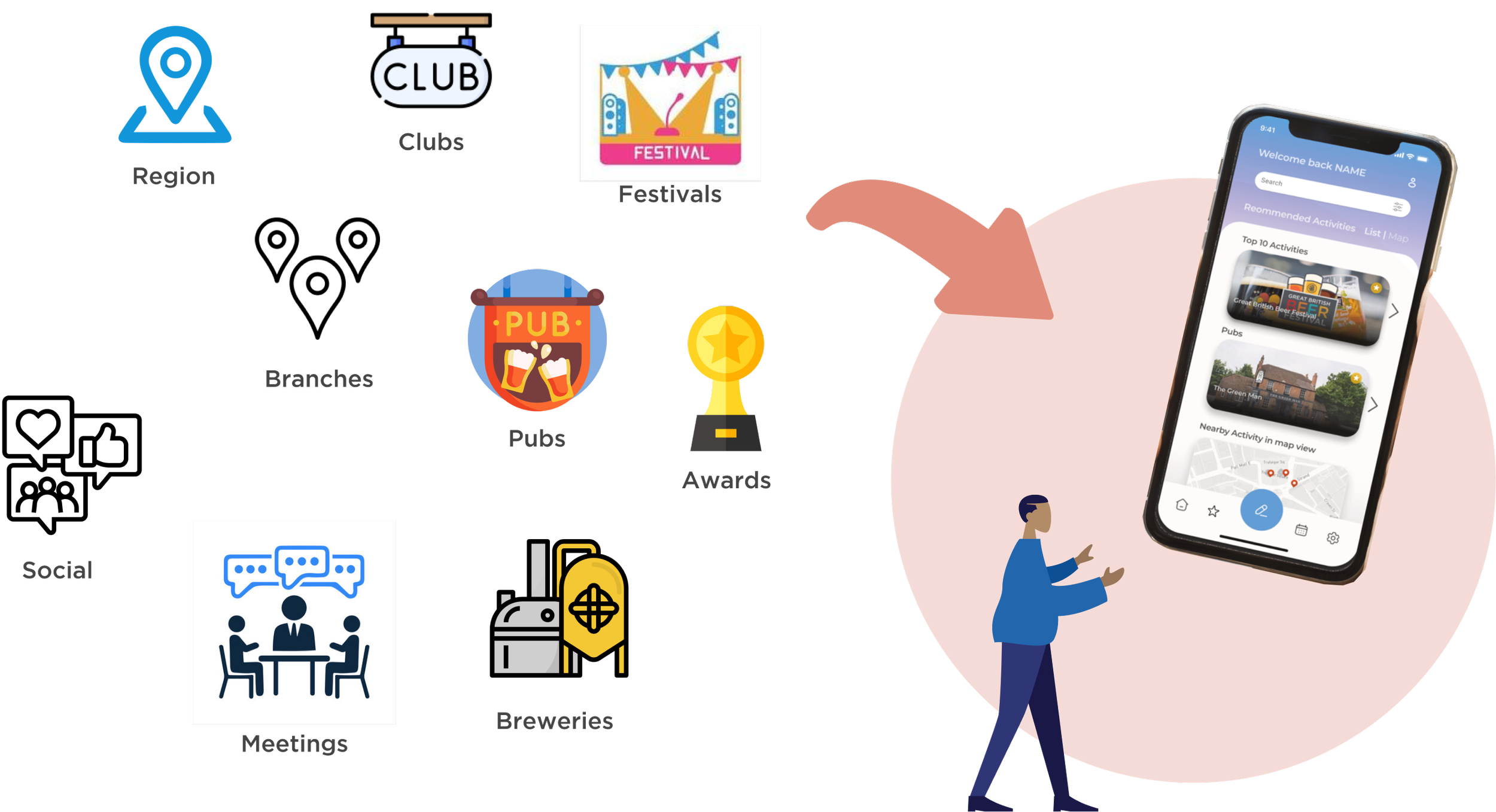
Campaign for Real Ale (CAMRA) advocates for traditional cask ale, real cider, preservation of the quality of beer, and keeping community pubs in the UK alive. This is with the help of CAMRA members who pay annual memberships.
CAMRA is associated with sites like The Good Beer Guide, WhatPub, and Learn & Discover platform, supporting beer education, pub listings, and real ale promotion.
🤔 Problem
CAMRA’s current website is
outdated
limited mobile responsiveness
key information spread across multiple sites
limited functionality
hard for users to find and engage with CAMRA's events, pub listings, and resources.
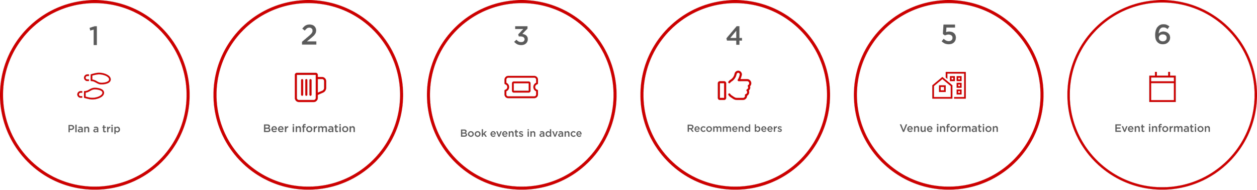
Based on user research, majority of the respondents wanted the following featured the most:
allow users to search for venues, breweries, beers, events
plan a trip
find a beer they like
✅ Solution
We believe that by integrating information from all existing CAMRA websites into the national website and implementing new functionalities, we will achieve:
a central hub
stronger engagement with CAMRA’s mission
support local pubs.
General response from our CAMRA members
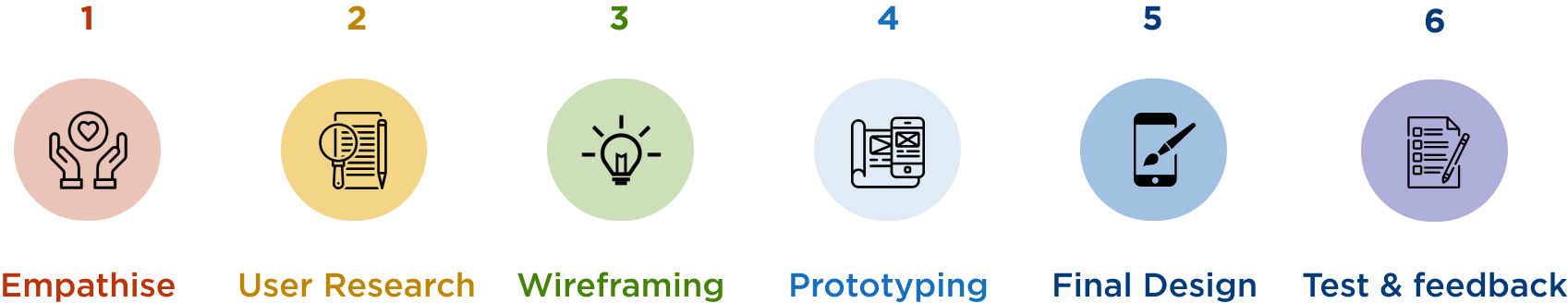
Design process
User Research
User survey
We conducted a survey asking various types of people and existing CAMRA members about pubs, events, beers, and breweries to understand what content and functionalities to prioritise. 847 respondents where recorded.
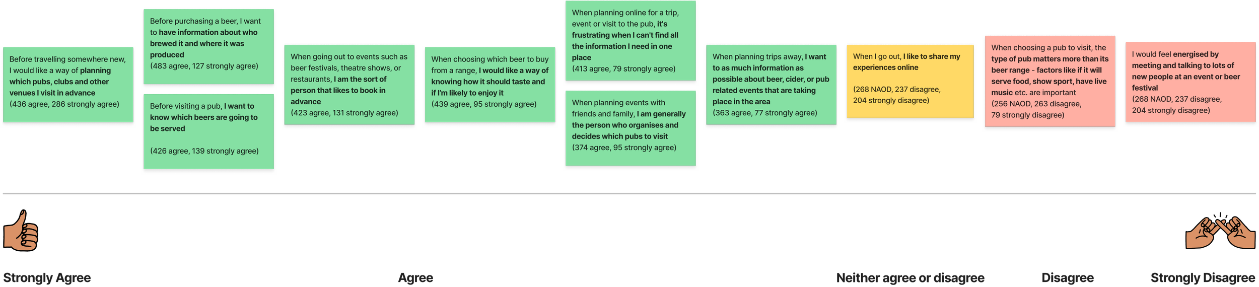
From the results we concluded our priorities in the following order:
trip planning
finding out information about beers, who brewed it and where it was produced
finding out which beers are going to be served
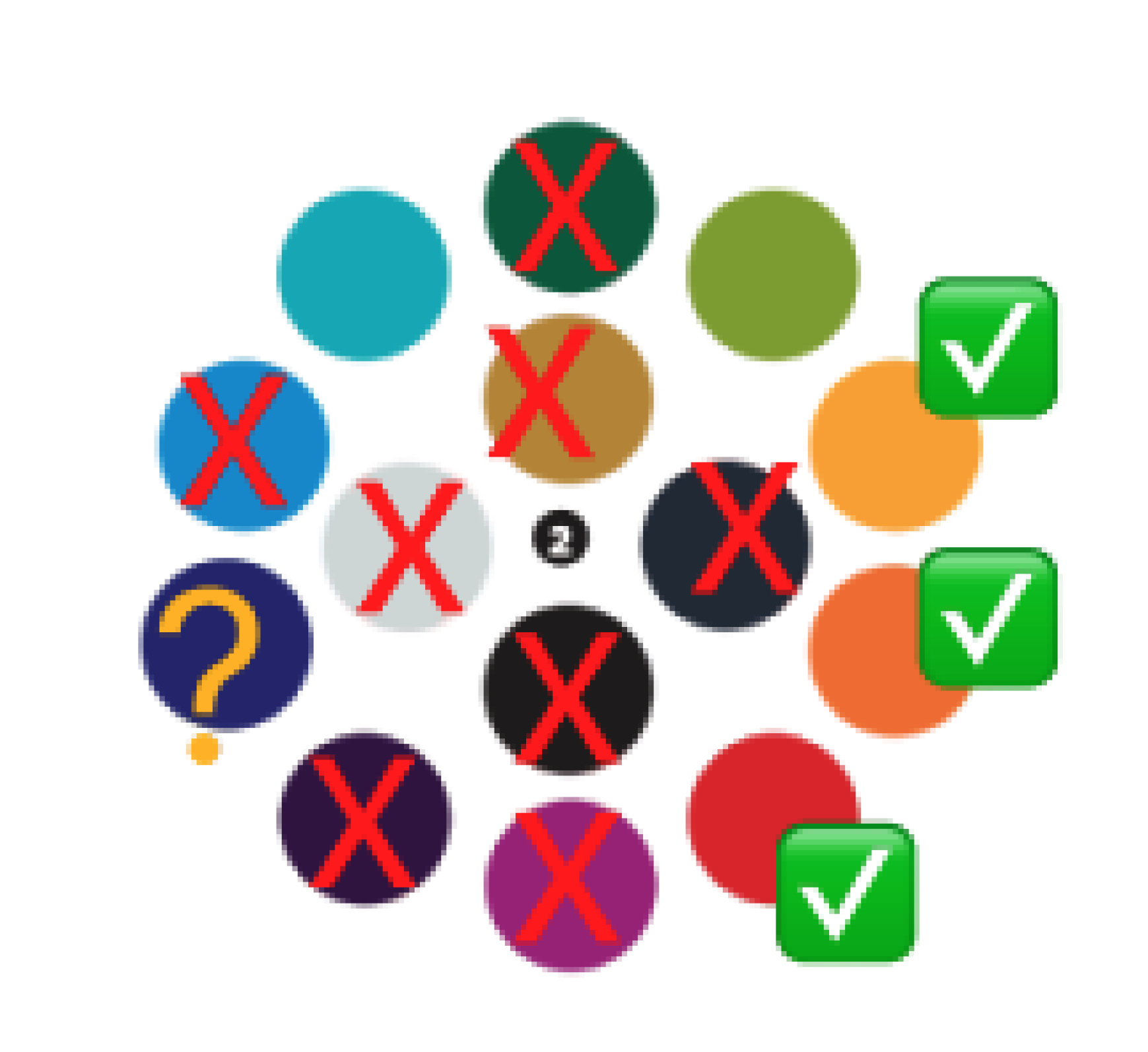
Also found out how many of our respondents heard of or have used the following platforms before.
Based on Jakobs Law, where users spend most of their time on other websites, so they prefer your website to work the same way as the sites they are familiar with. Therefore, we want to implement a similar layout to minimise the learning curve.
As the trip planning feature will be more beneficial on mobile, it was imperative to see which whether users uses mobile or desktop and apply Jakob’s Law.
I have heard of this but not used it
I have used this as an app or on mobile
I have used this via the web/desktop
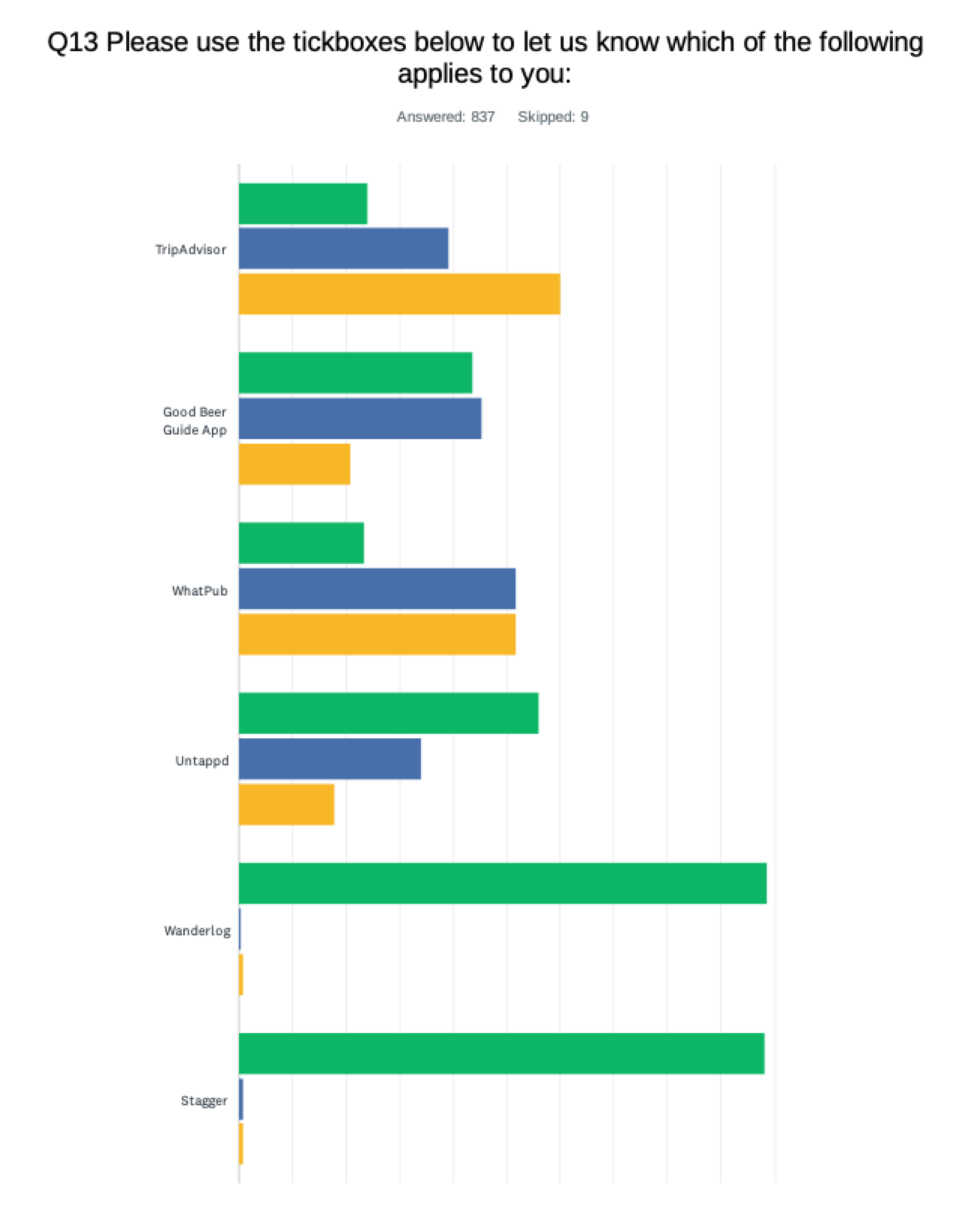
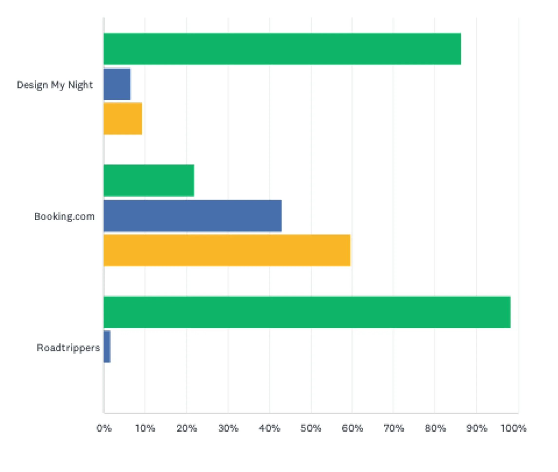
We excluded the Good Beer Guide app and Whatpub as they were existing CAMRA sites we want to deviate from and we believe there is a bias towards them from the existing CAMRA members, as they already knew of those platforms. From our findings we discovered that:
people used trip advisor and booking.com the most on desktop more than mobile
a lot of people heard of and use untappd on mobile but not many used it on desktop
a lot of people have heard of but not used Wanderlog, Stagger, Design My Night and Roadrippers
Competitor analysis
I created a competitor analysis based on the website/mobile platforms people have used the most, included similar websites that have gained more popularity recently (e.g. Airbnb and Forbes Travel Guide) and platforms people heard of but used the least. This is to:
extrapolate the existing positive aspects of each platform to implement into the new CAMRA website
discover why some platforms perform better than others by weighing out the pros and cons
assess if our desired functionalities already exist, if so, how effective they are
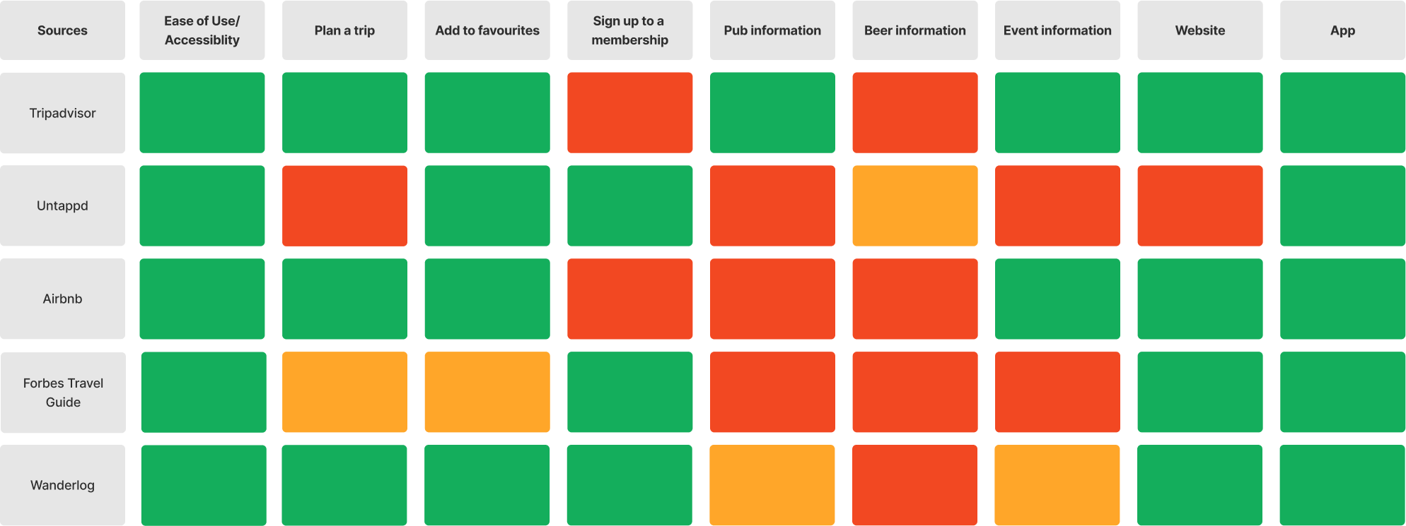
We found that:
Tripadvisor and Airbnb consists of the most positive aspects relevant to what we want to implement in our website, the only thing missing is they don’t contain beer information, memberships (applies to trip advisor and airbnb) and pub information (applies to airbnb)
Tripadvisor is the only platform with pub information but at a surface level
Forbes Travel Guide entices users to sign up to their membership
None of the websites have beer information, only Untappd
Tripadvisor and Airbnb will be highly influential to our website due to their efficient features and clean layouts. We will also only be implementing Wanderlog’s modern components such as their buttons and iconography as not many people use the platform. Understanding how Untappd’s beer information was laid out aids how I will prioritise beer information on the beer page.
Wireframes
a. easily accessible features and call-to-action for memberships
b. give the user freedom to search for anything or use their current location
c. helps the user pick up from where they left off. This could be venues, events, beers etc.
d. recommendations
e. emotional call to action
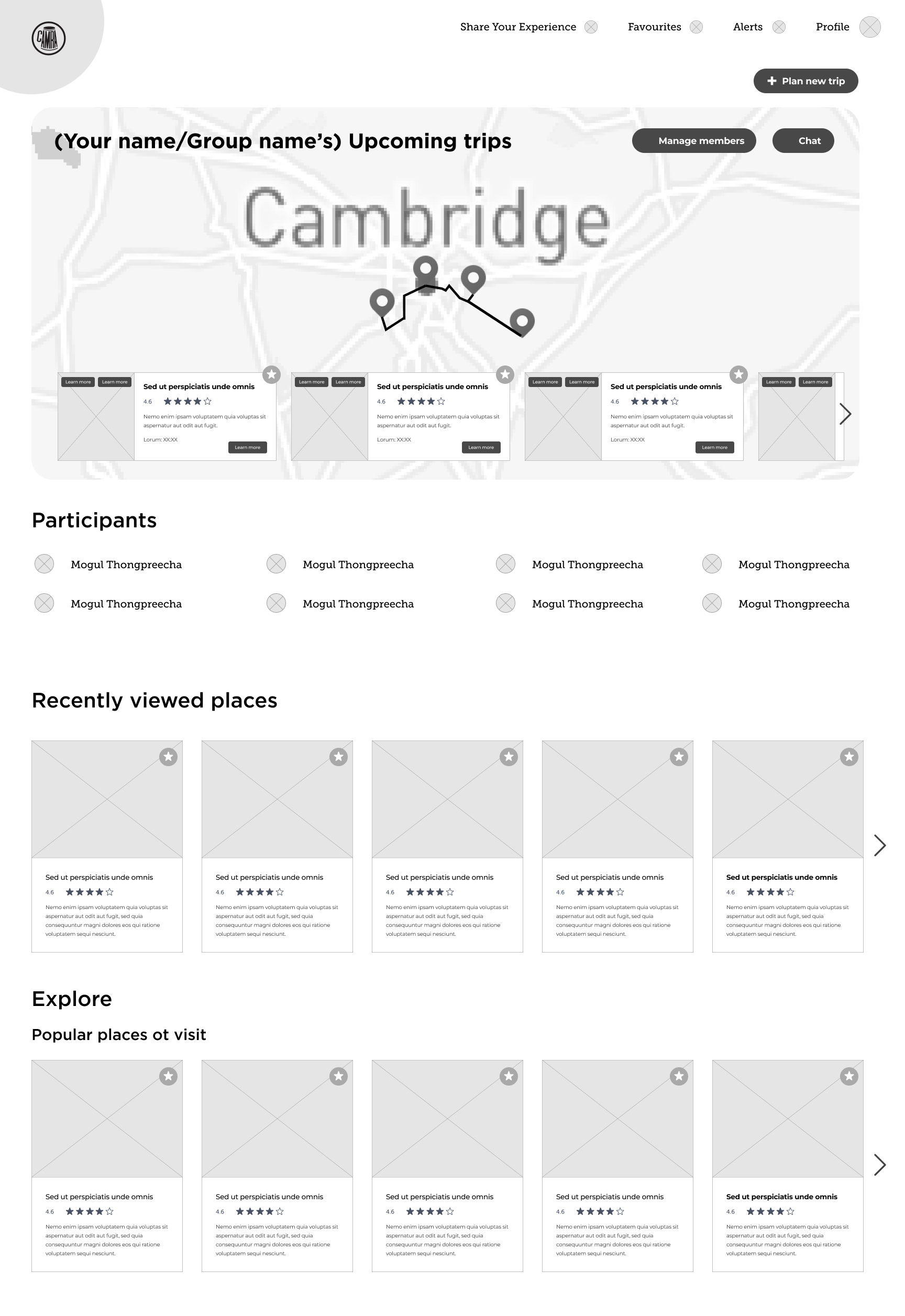
Homepage
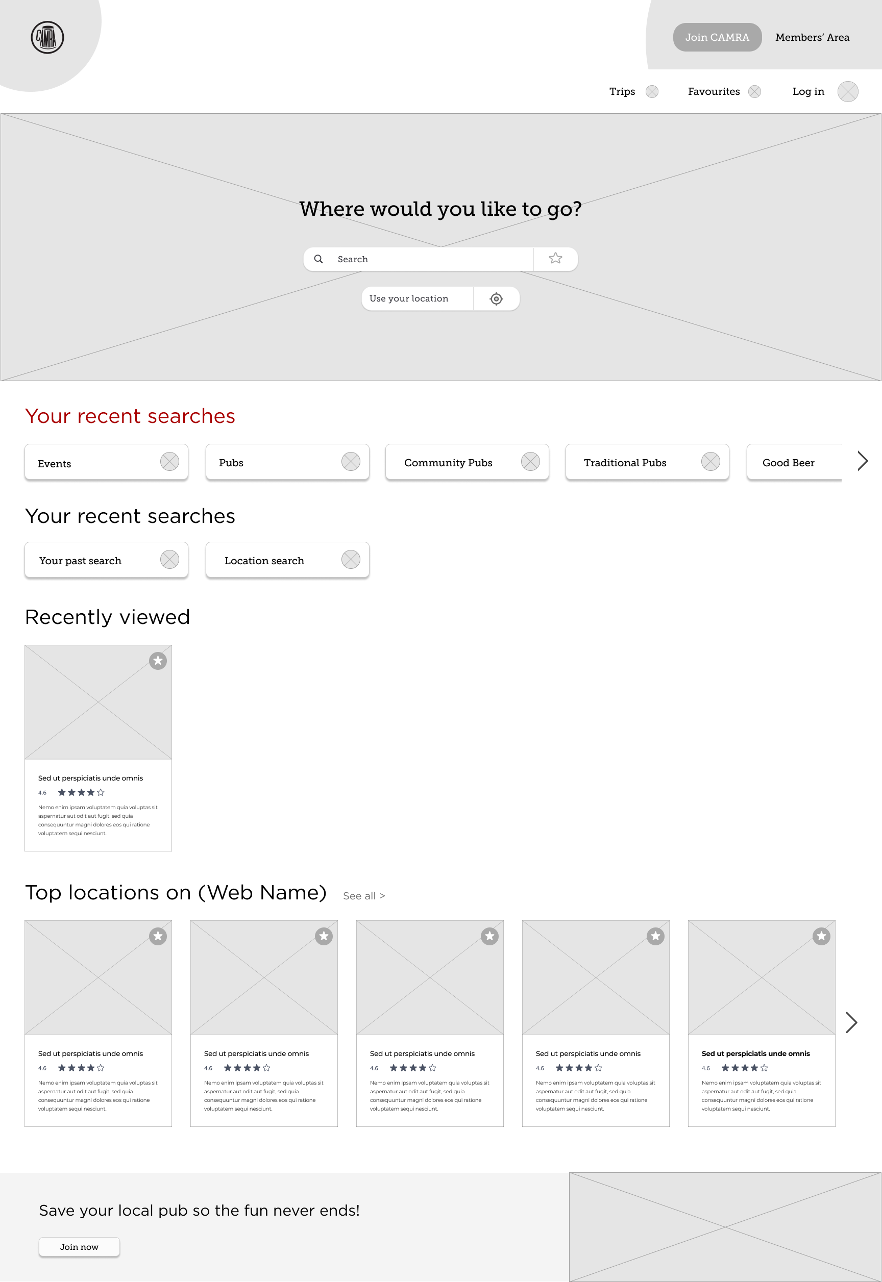
b.
d.
e.
c.
a.
i.
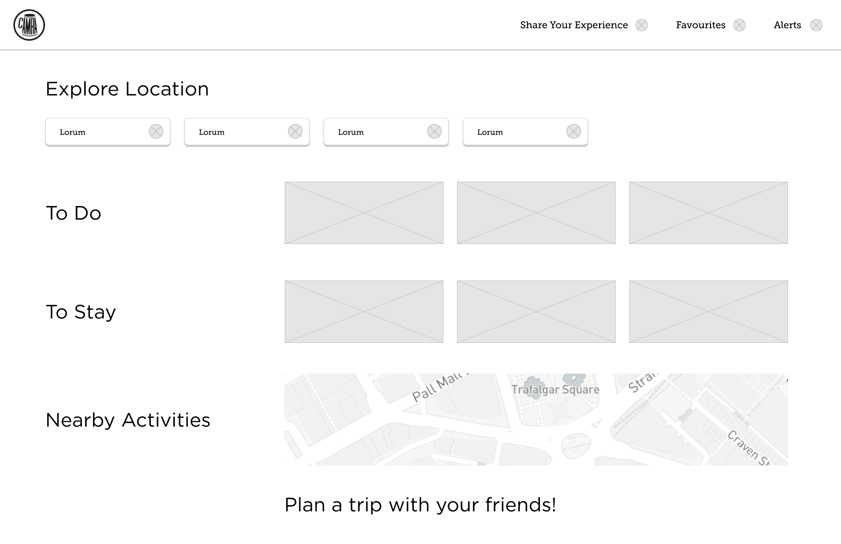
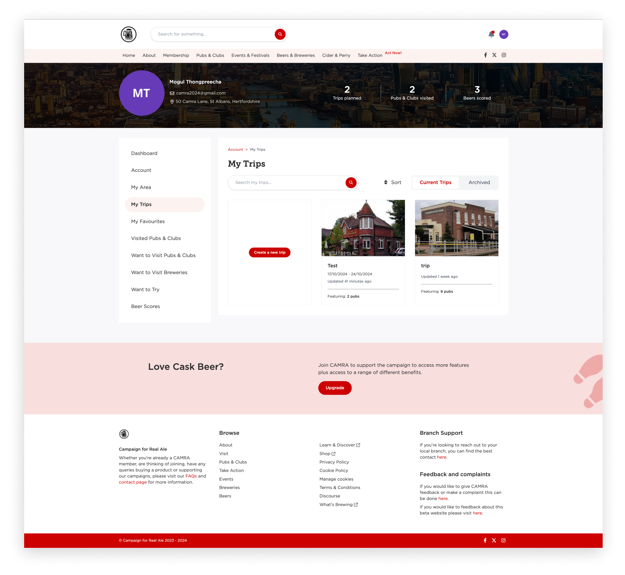
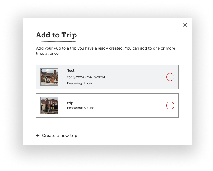
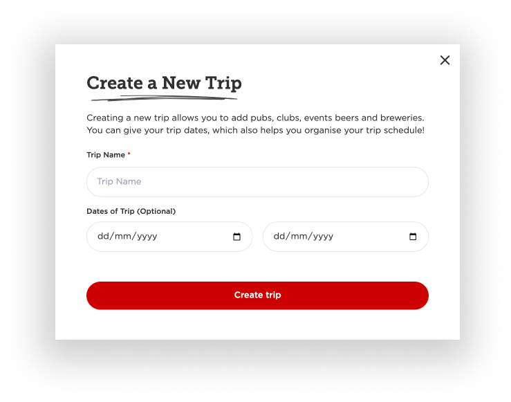
Your Trip page
f.
g.
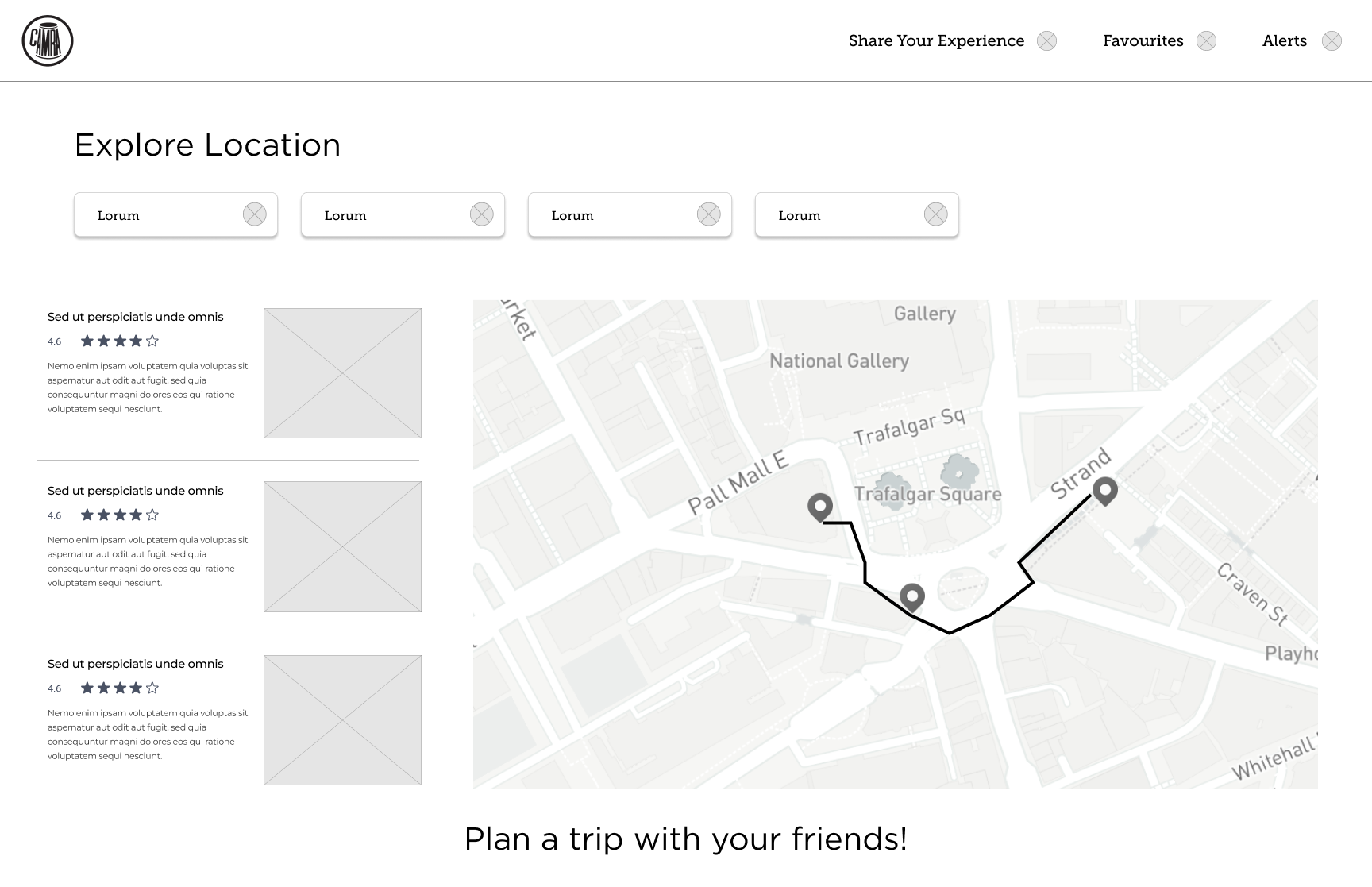
Venues list map view draft 1
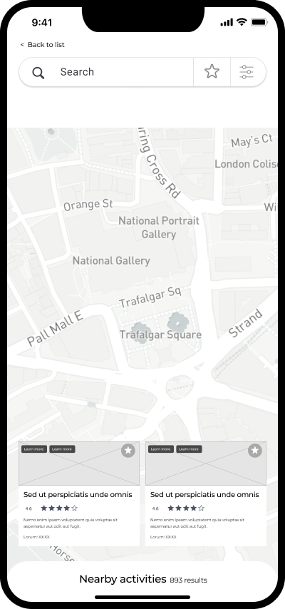
Venues list map view mobile
j.
l.
k.
h.
f. easy trip management
g. visual representation of how far each venue is, easier to plan trips
h. collaborative element to make the experience more interactive, encouraging other people to use the site
Venues list map view draft 3 (chosen)
Venues list map view draft 2
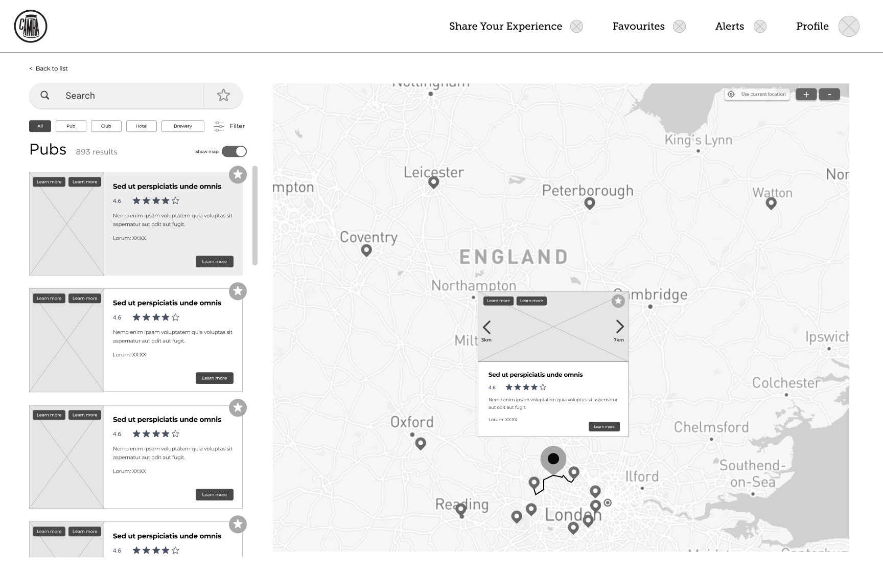
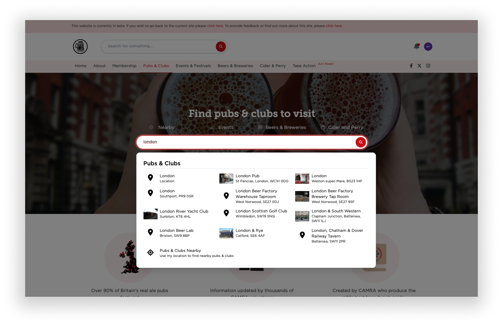
search bar
filters
toggle option
efficient display of information
more map visibility
i. search bar
j. favourite
k. filters
l. recommending nearby venues and activities
Design decisions
Rebranding
The original website colour scheme was blue and yellow, which did not pass the accessibility checker. This is an analyser that indicates how readable and colour blind friendly a website is based on the contrast between the text and background. So I knew a rebranding is required.
Using the existing branding guidelines I ruled out the unsuitable colours and narrowed down to four colours; red, orange, yellow, dark violet.
Colour scheme guidelines
Final decision on the colour scheme
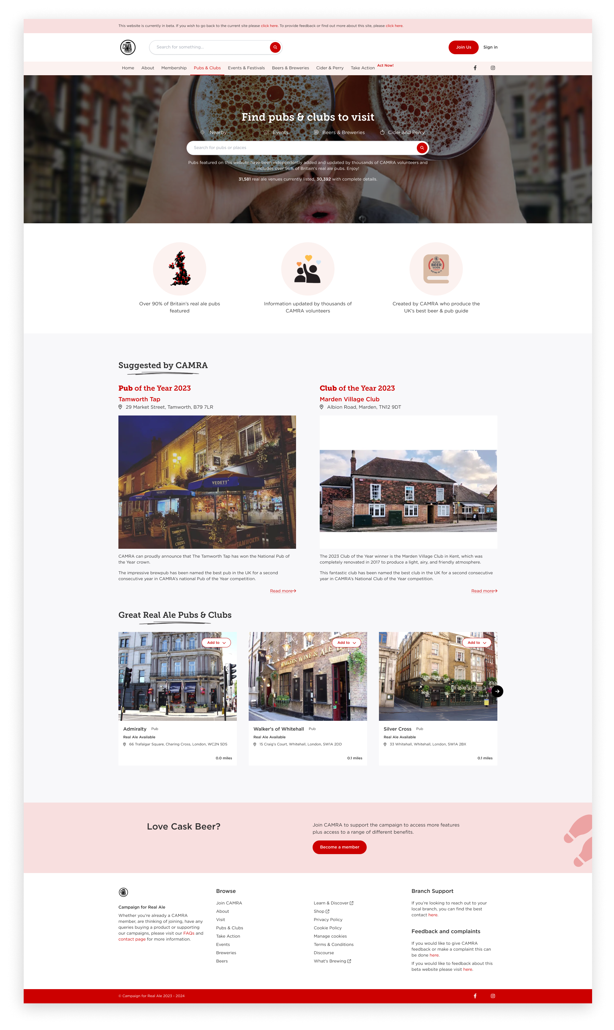
Collectively we agreed red was the chosen colour as it was impactful, memorable, and conveys excitement and urgency to interact with the website. It also reminds people who currently know CAMRA of WhatPub.
Orignal website
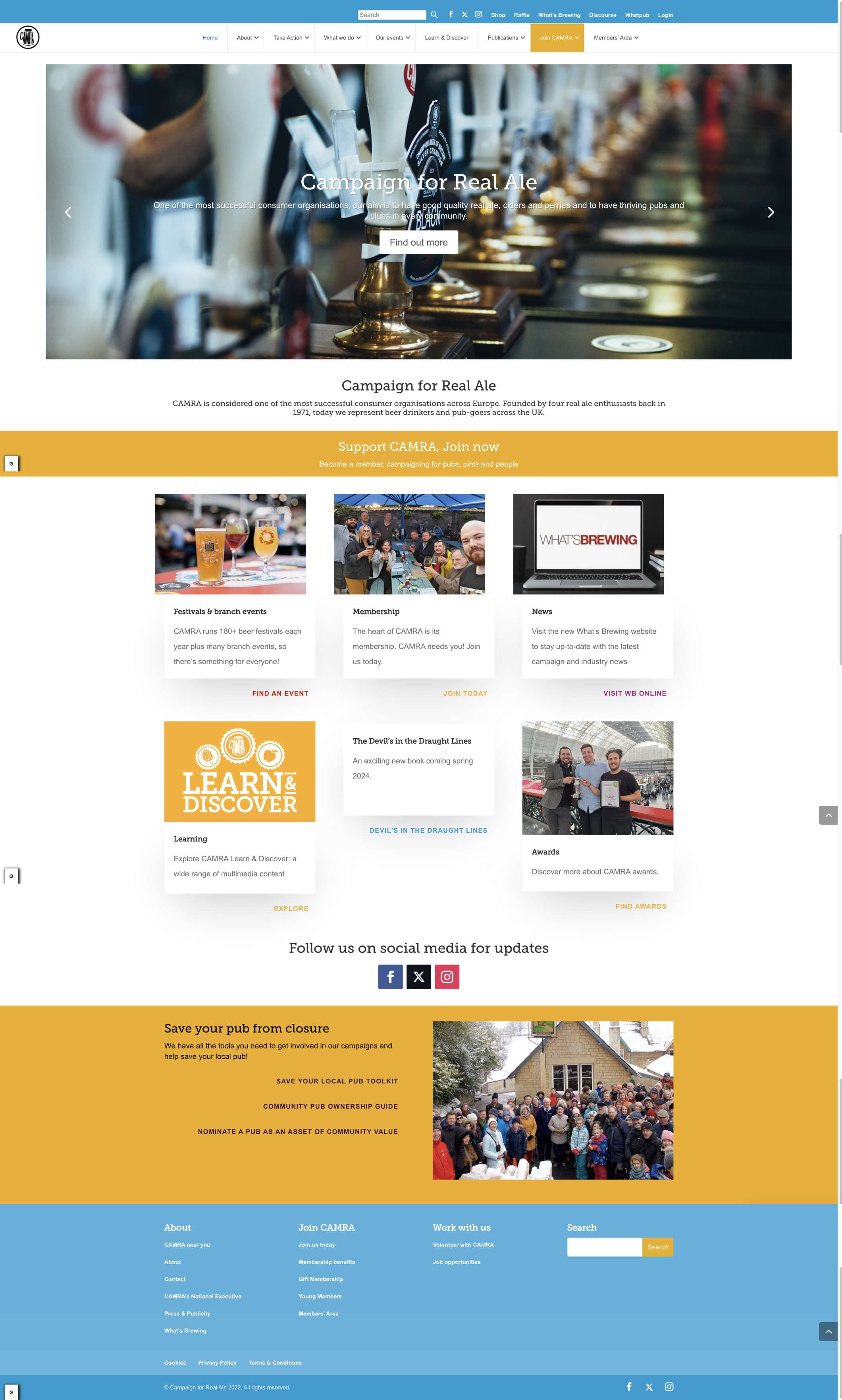
Final four decision; red, orange, yellow, dark violet
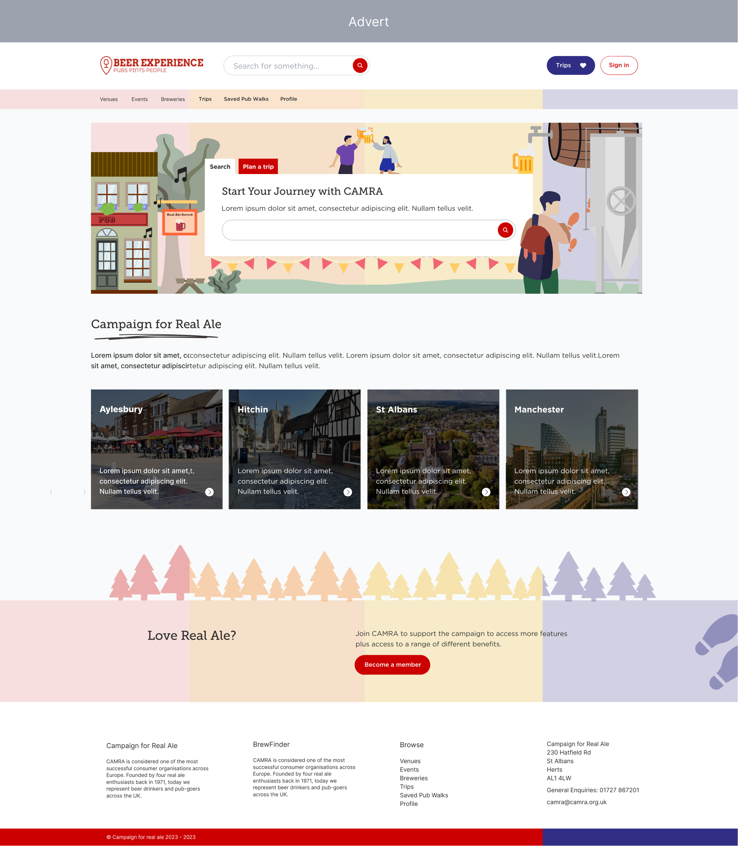
Whatpub
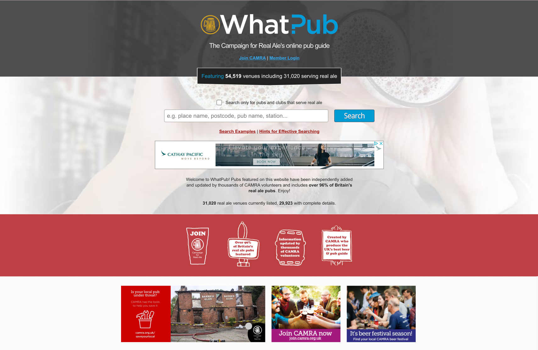

New website
Testing and Iteration
Usability Testing
We gathered a focus group consisting of existing CAMRA members, volunteers and the general public to test out the soft launch version of the website. We did this to test the usability and clarity of information. These methods were done remotely, however they were effective.
Desktop Testing
Mobile Testing
Video recoding tasks
A series of tasks were assigned to the user, each question only being visible when the user has completed each task. We also record the amount of time each task takes to complete and a brief survey at the end about their experience.
Microsoft clarity
This method of user testing shows the activity of where the users' mouse has moved, clicked, types of clicks and general activity on the site. From this we will be able to see how they engage with the site and what causes them to stay or drop off.
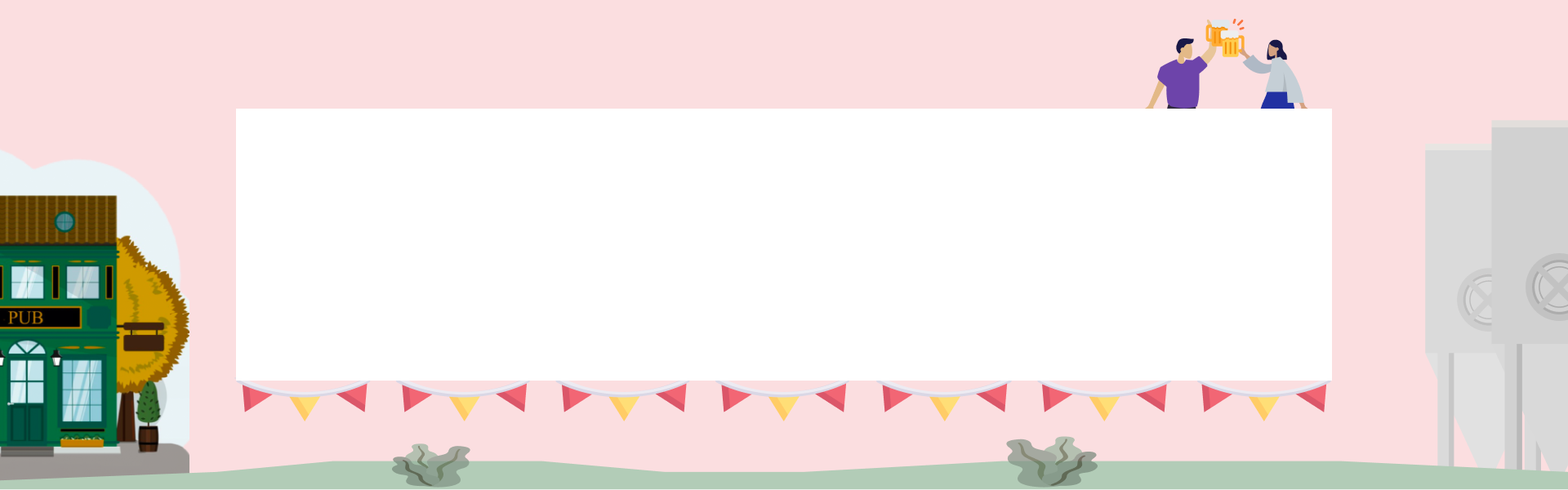
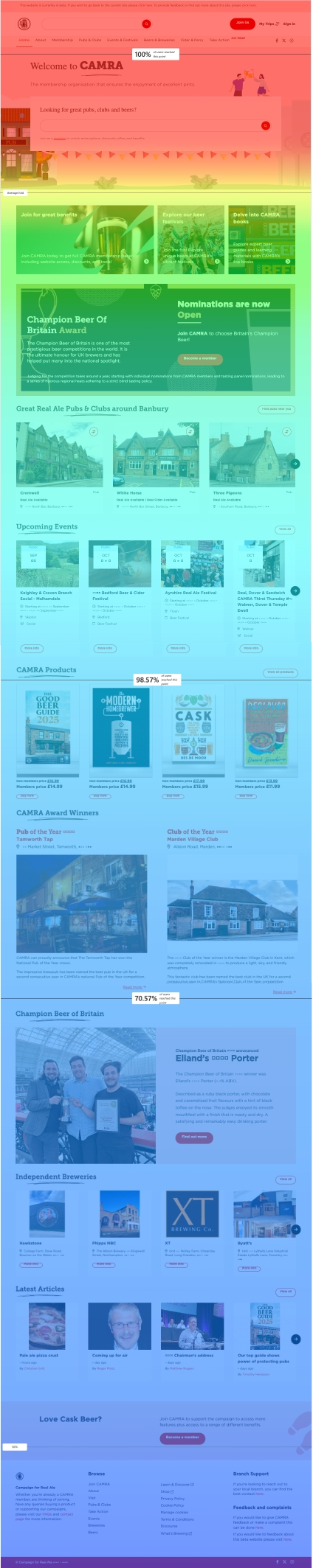
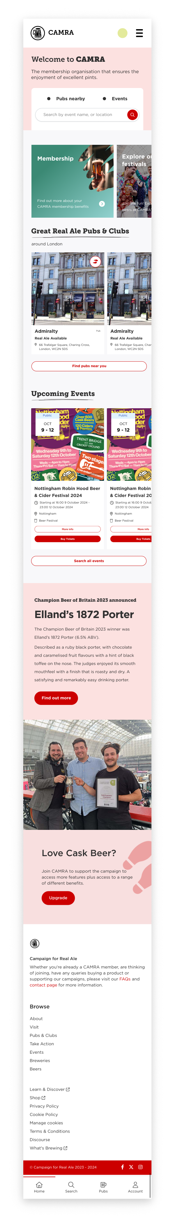
Hero section homepage design
people did not know where to click as their mouses hovered sporadically around the banner.
not many people clicked the buttons above the central search bar.
I made the banner fill up the page to prevent distractions
I removed the white and red button above the central search bar.
I put the title of the company at the top to reinstate where they are rather than having it below the banner.
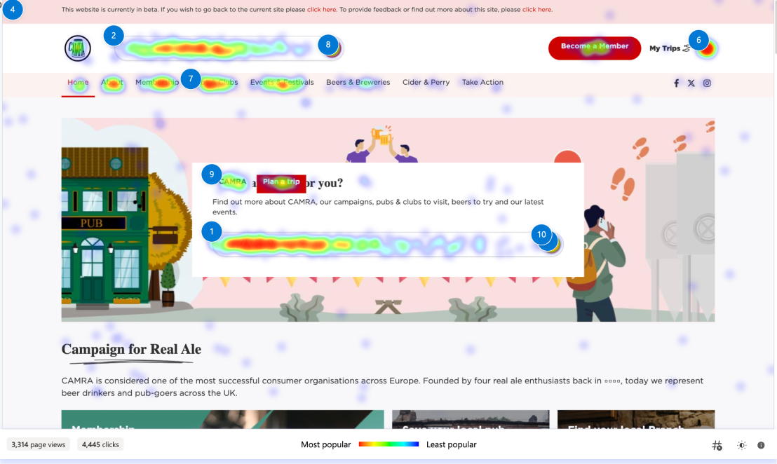
Test version
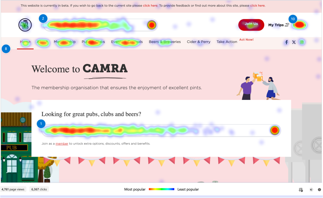
Improved hero section
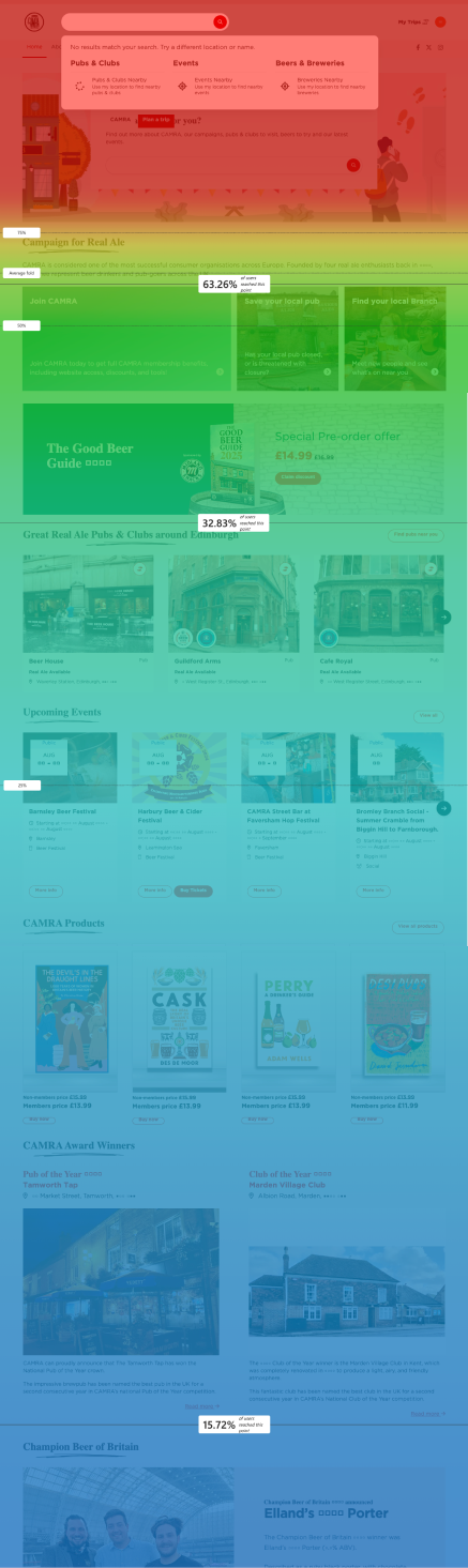
Scrollability checker
However, by filling up the hero section now over 90% of users scrolled past the midway point and only dropped to 47% at at the footer.
95% have reached this point
70% have reached this point
50% have reached this point
Research and Development team day
We took a hands-on approach during the team day. The IT team was assigned tasks related to using the mobile version of the site. Only one person complete each task at a time to keep the scenario as realistic as possible.
Tasks included:
1. Visit the local Sainsbury’s and look for any beers CAMRA Campaigns for. List your findings.
2. Find the pub with a spacious retreat in a garden, enjoy a pint of real ale (…)
3. Find a pub with two regular beers one ever-changing option (…)
4. Find a pub featured in the Good Beer Guide (…)
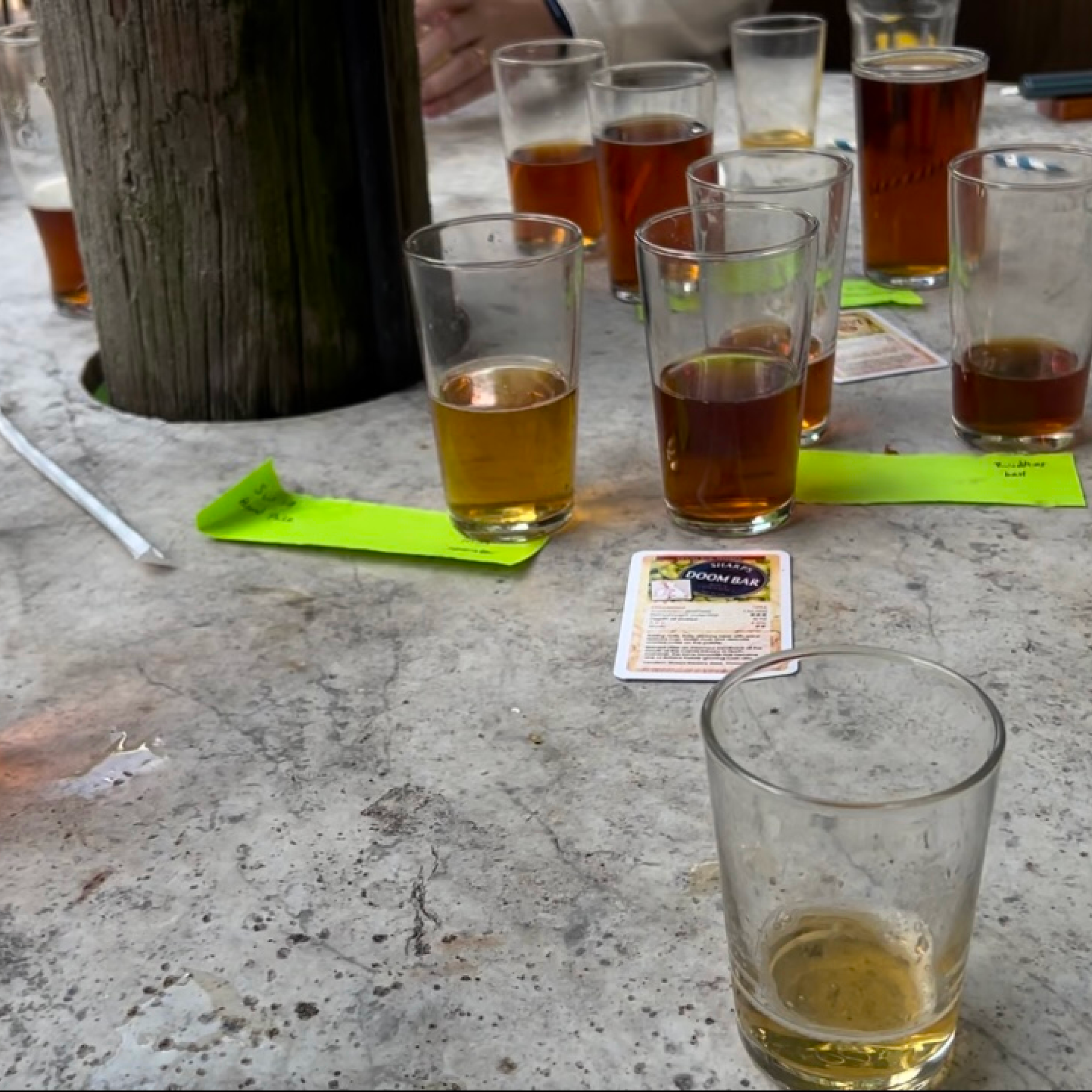
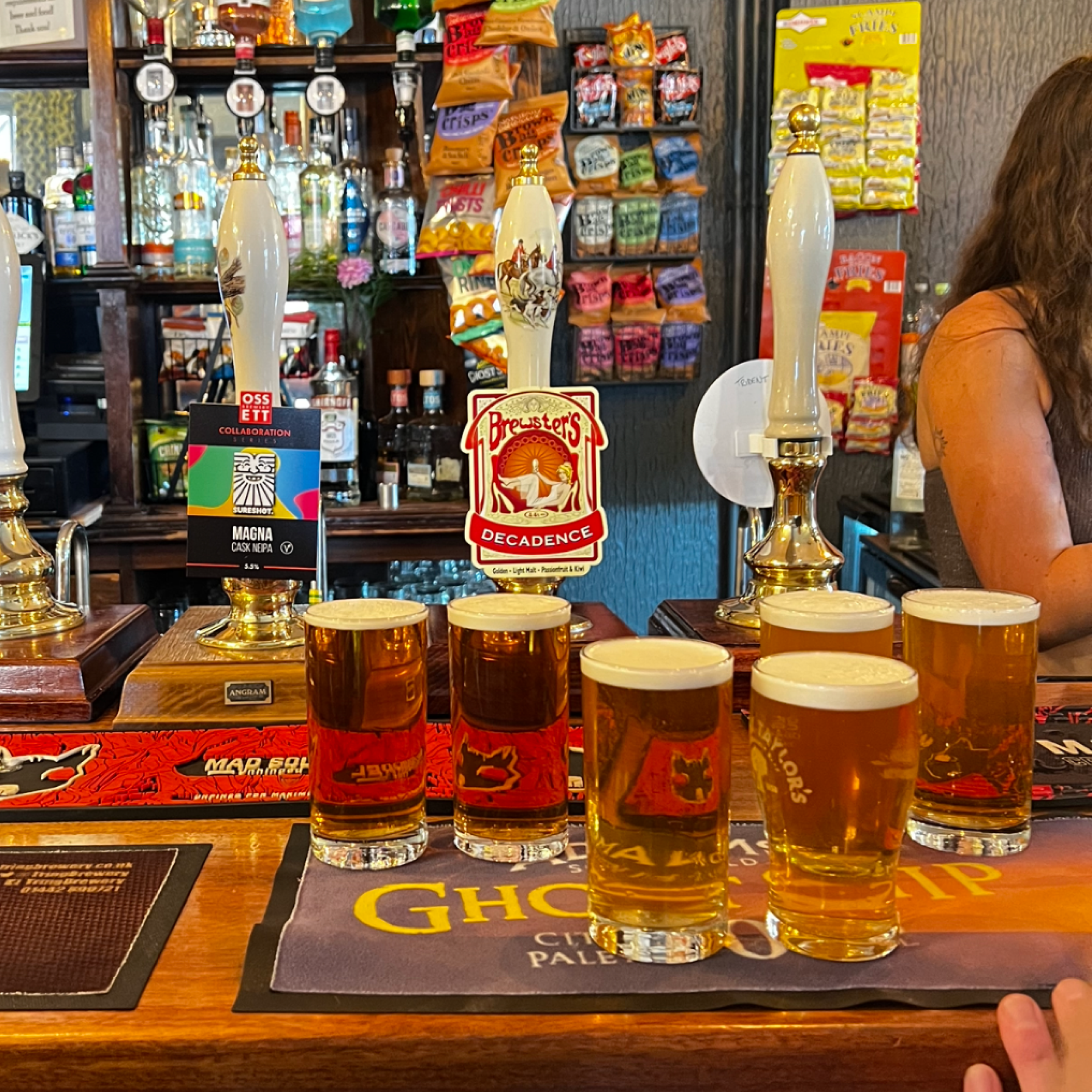
5. As a collective we taste tested beers at certain pubs to asses the accuracy of the information provided by expert beer judges.
Test version
The test version where the hero did not fill the page may have caused 50% to drop off by halfway.
63% have reached this point
32% have reached this point
15% have reached this point
Improved hero section
The next day, we collaborated remotely and created a retrospective to understand who and why each person struggled with using the mobile website to complete each task. We discovered that there were flaws with the mobile version
Our insights:
ambiguity in the meaning of the new functions
a lot of scrolling
images being too large on the screen
unclear spacing in between the filters
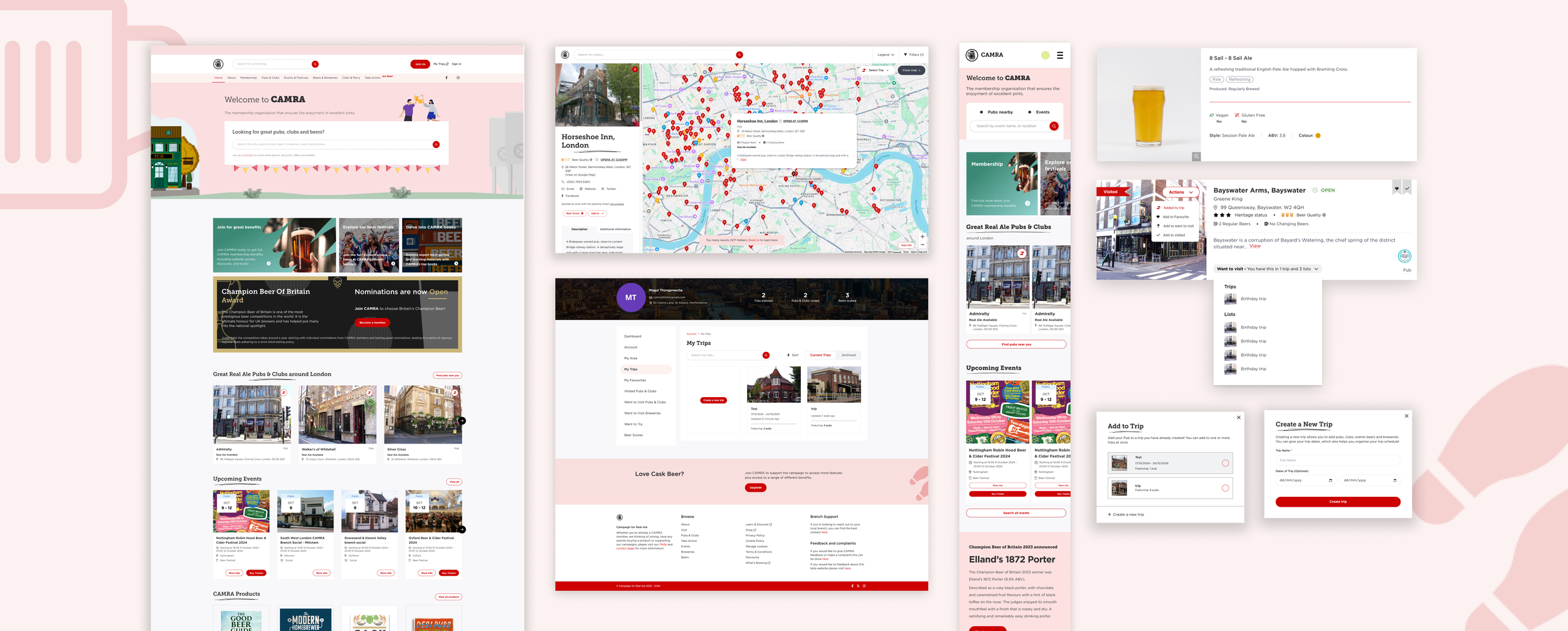
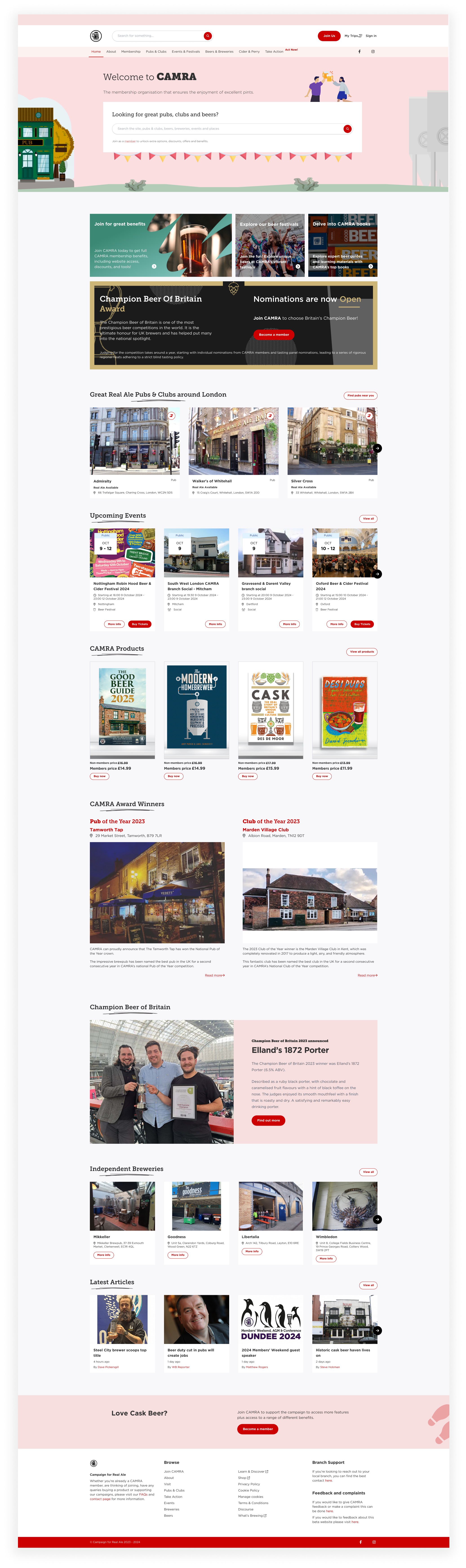
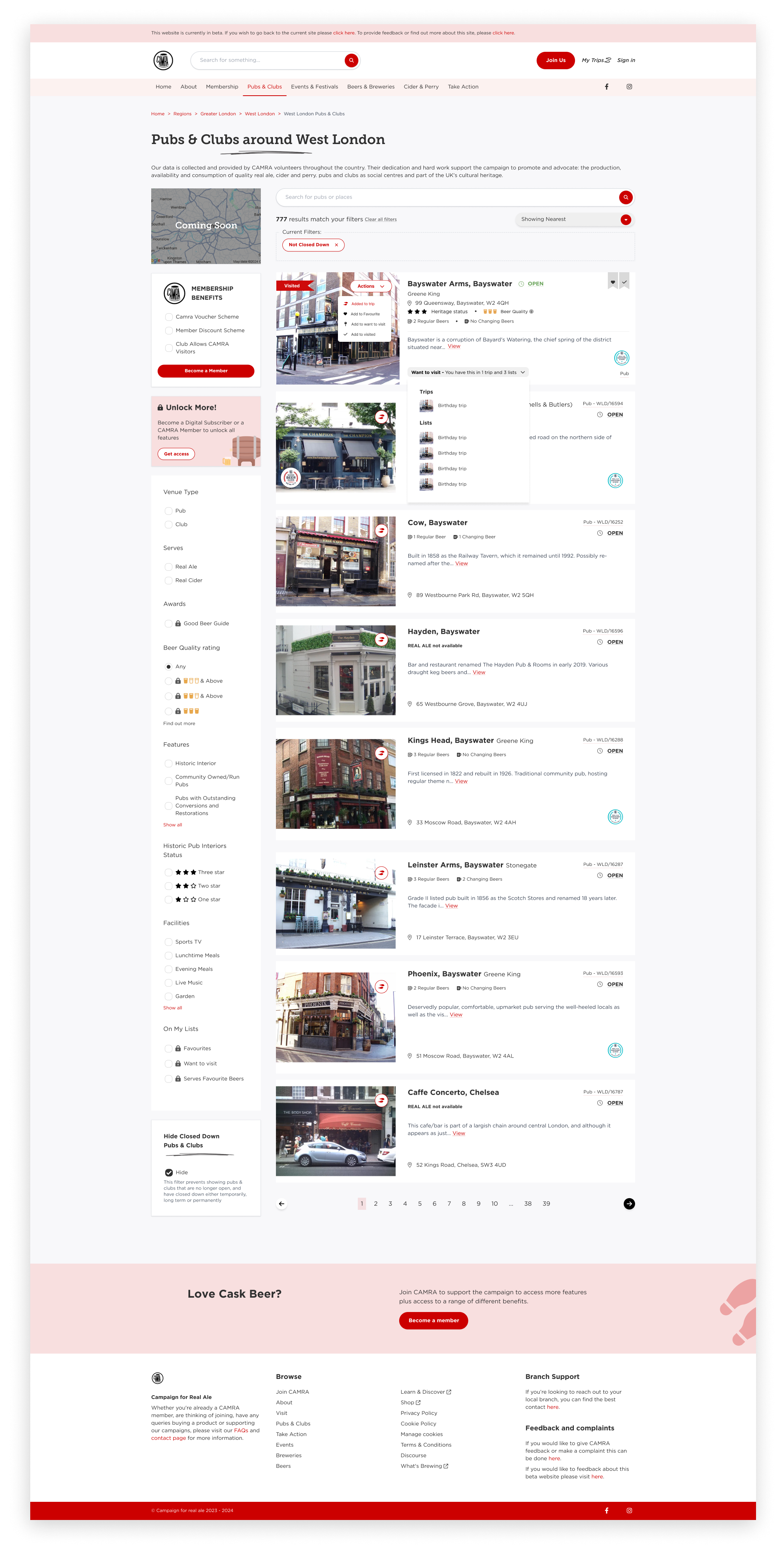
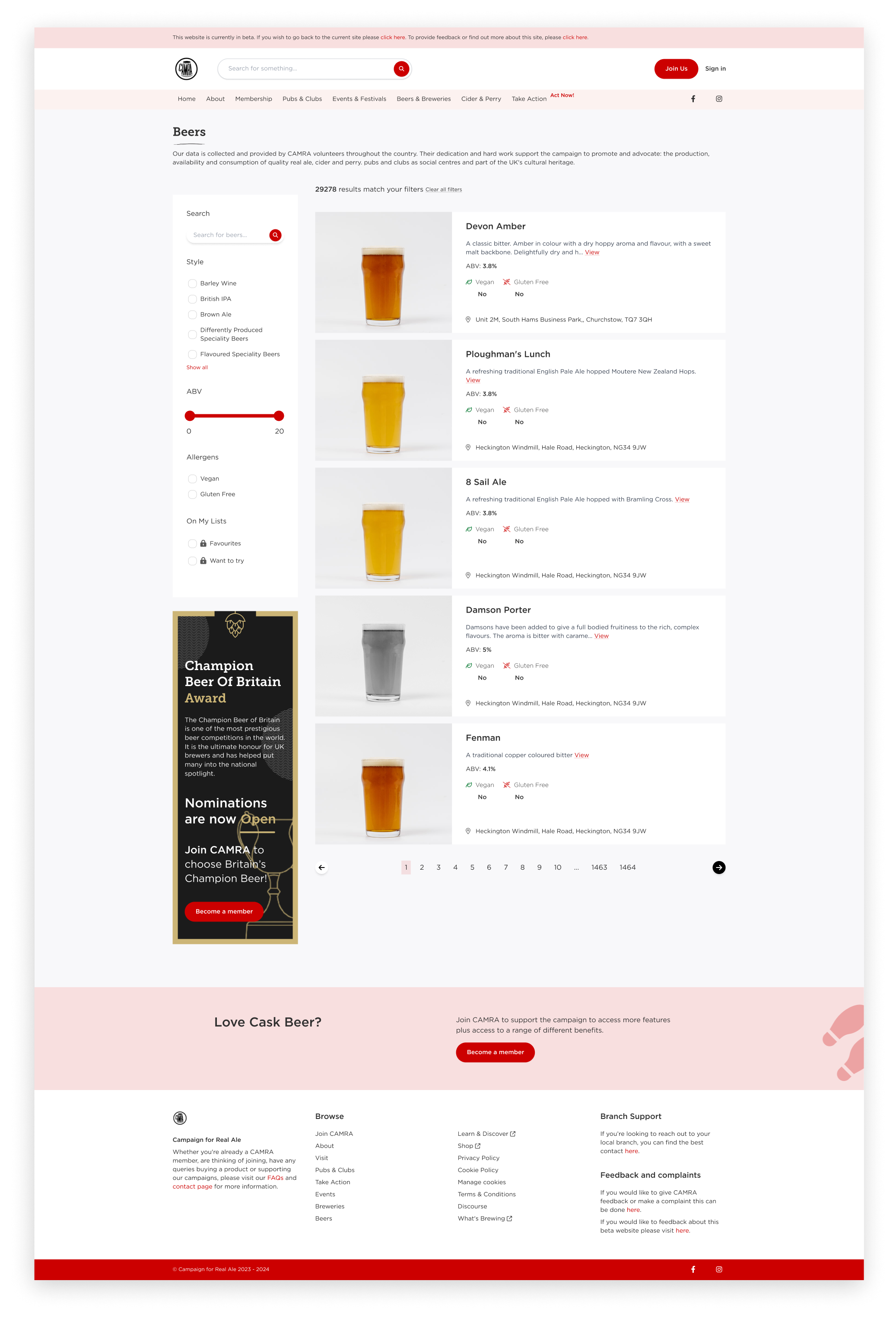
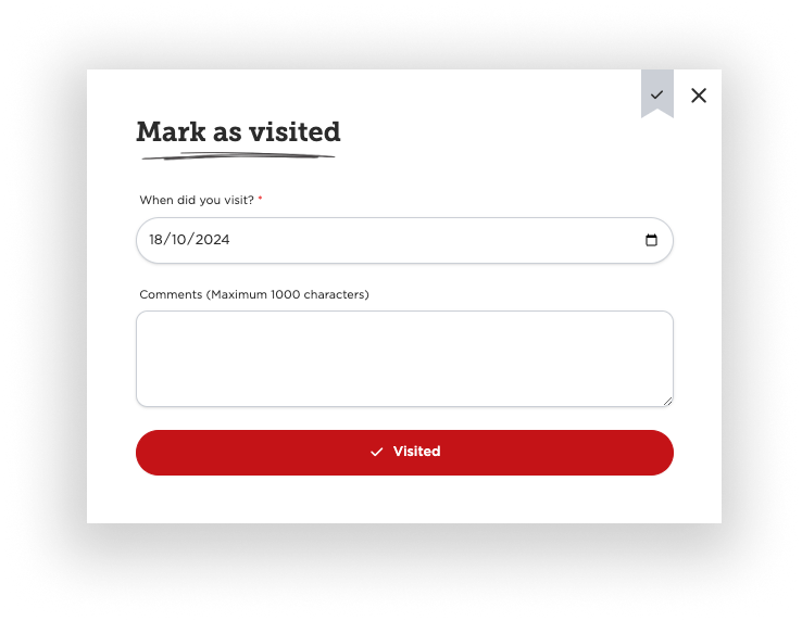
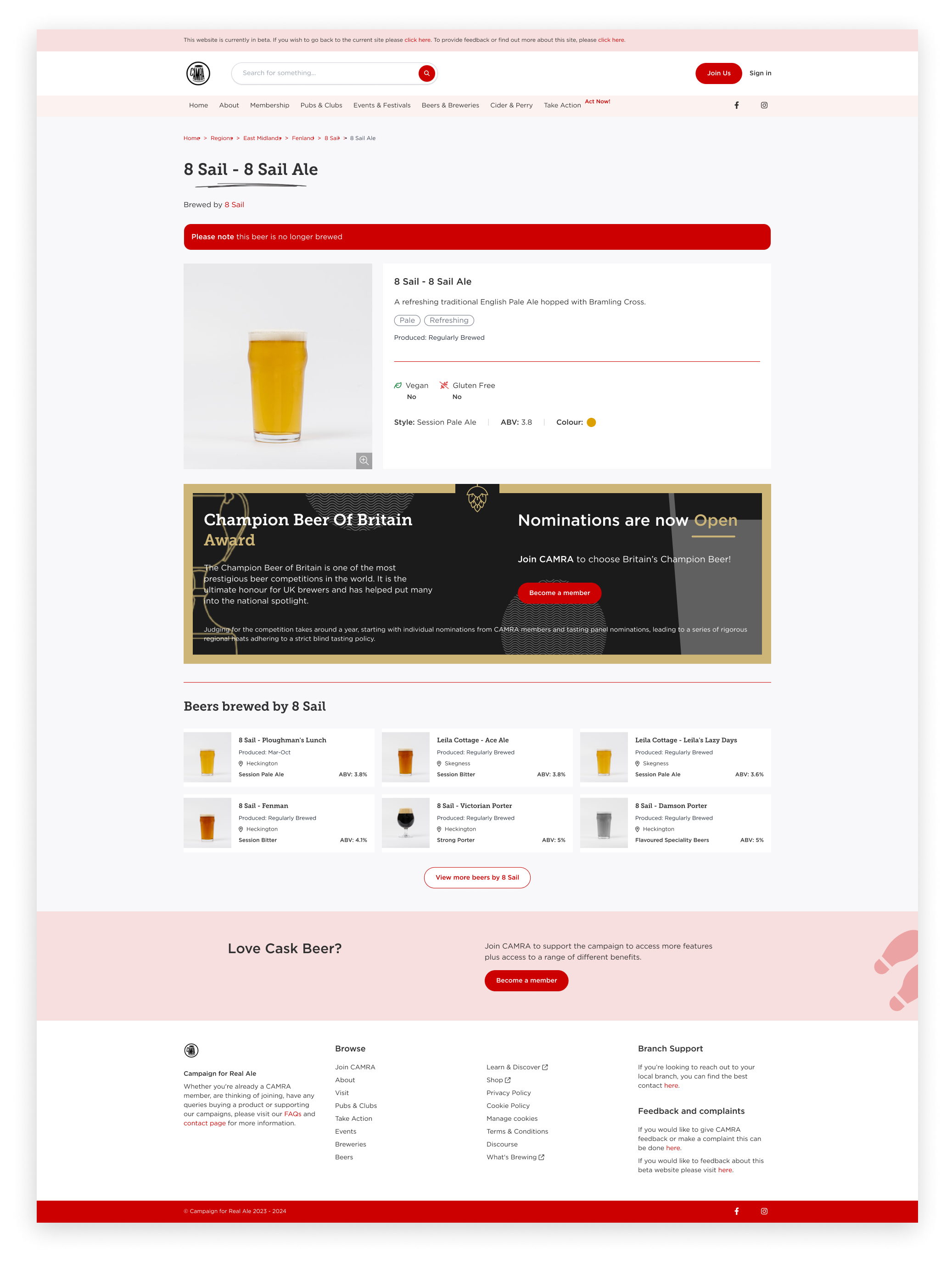
Final Design
Final Design
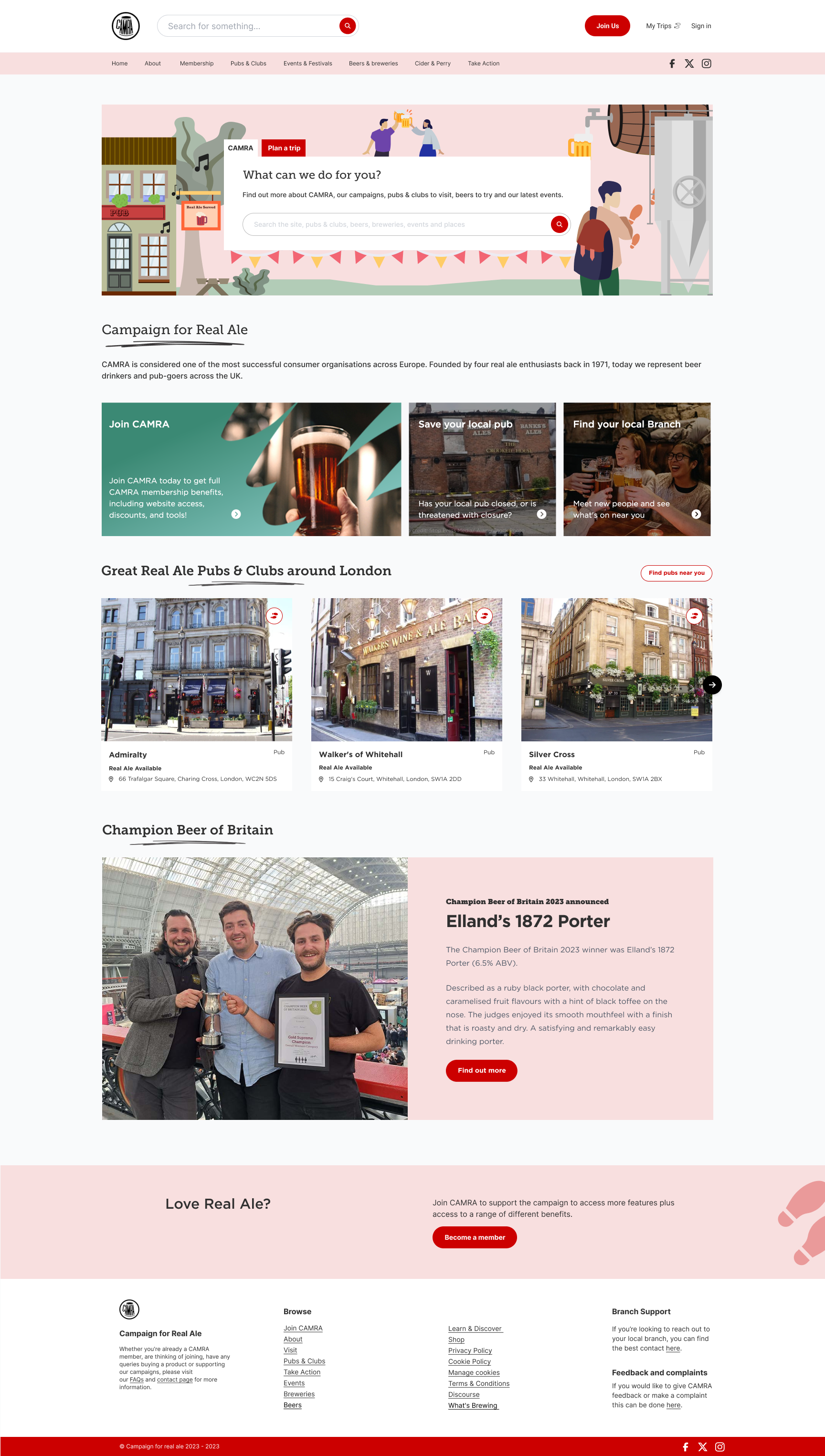
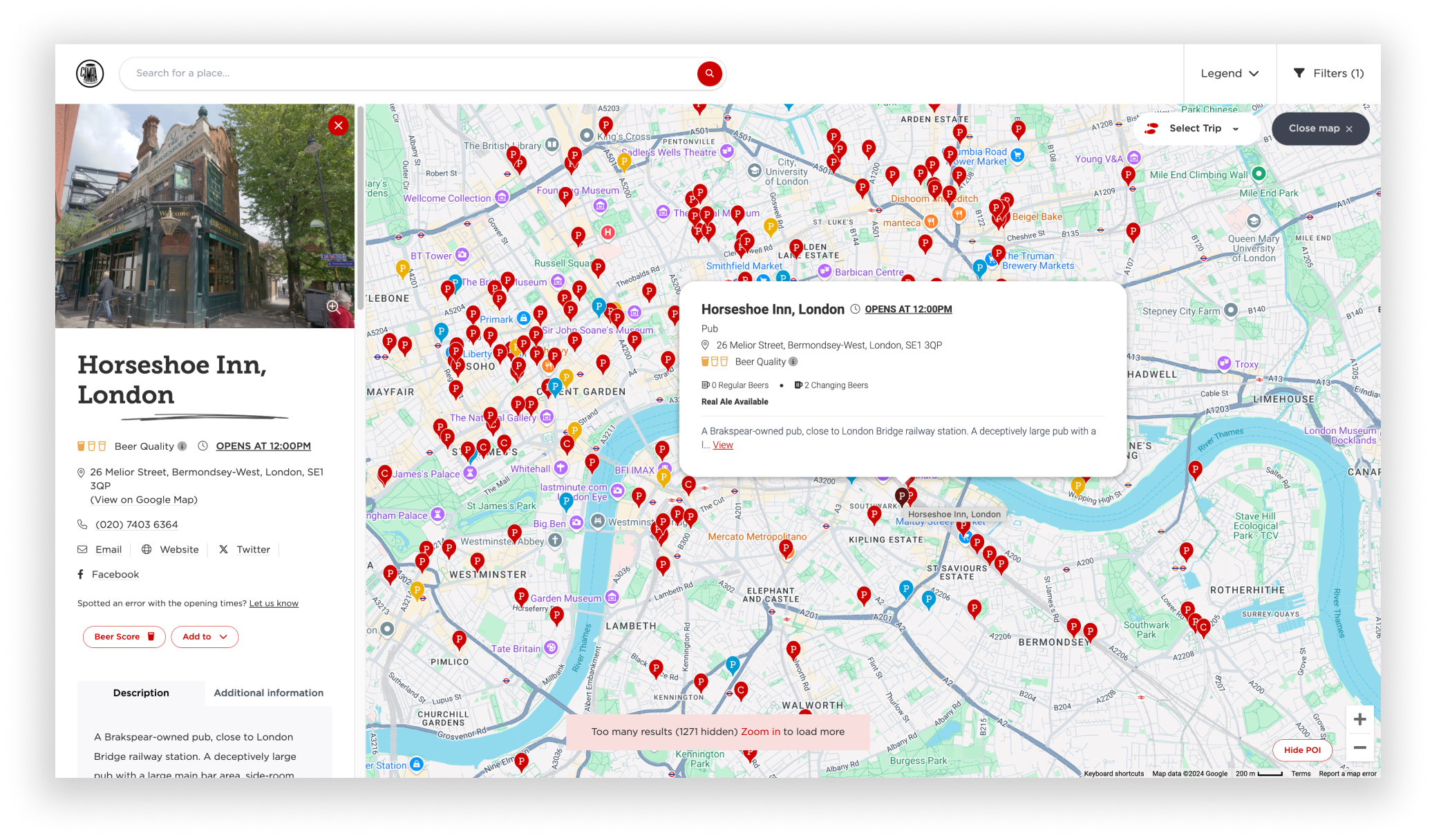
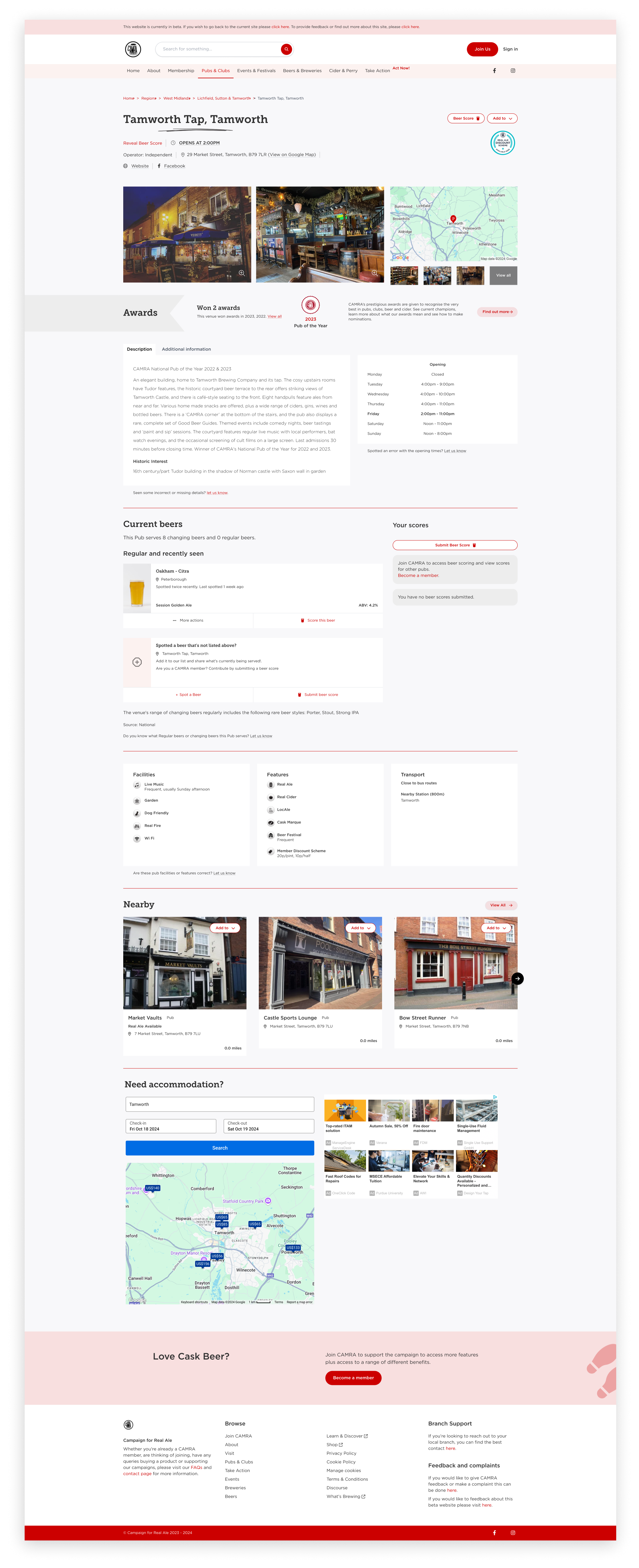
Below displays all the new features incorporated into the new website. Link to the website: https://www1.camra.org.uk/
High-Fidelity Designs
Project learnings
worked together to establish a smooth design process to development
although i was the sole designer, team morale was great as they were open to bouncing off ideas off each other, despite working remotely. this resulted in improvement in the team’s communication and collaboration. using tools such as FigJam aided the process
Limitations/constraints
time restraint from testing to official launch
only some design changes were implemented
Impact metrics
5 x
more new users
2 x
engagement from last year
606k
appearing in Google Searches
344
new members (10% new users) from using the new functions
75k
click through